The illustration below maps out the organisations under Disability Division within the Ministry of Social Justice & Empowerment, India. The organisations are categorized under the 5 heads as per their roles & responsibilities.

The illustration below maps out the organisations under Disability Division within the Ministry of Social Justice & Empowerment, India. The organisations are categorized under the 5 heads as per their roles & responsibilities.
Know more about Ability Project

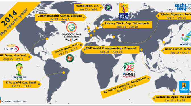
From the FIFA World Cup to the Commonwealth Games, the year 2014 is studded with major sporting events across the globe all throughout the year. And here is the infographic that features major sporting events which you surely don’t want to miss. So be sporty and gear yourselves to experience all the sporting drama.
data source: Wikipedia
made by Vipul

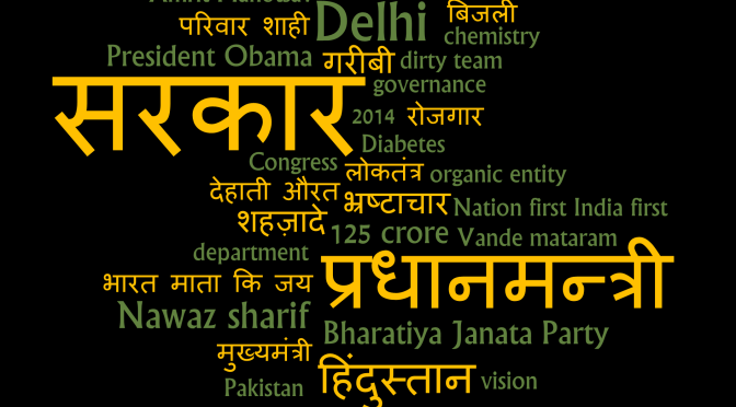
The World Cloud is based on Narendra Modi‘s speech delivered on October 27, 2013 at the national capital. It looked as if BJP’s Prime Ministerial candidate for 2014 elections was in his best of oratorical skills blaming UPA government for all the troubles of nation and its people. In midst of talk, he managed to spark a thunderous response of applauds as well as huge uproar of slogans by the audience by ridiculing the government with amusing phrases and stories.
Well, it would be only in 2014 one would conclude whether his speeches were catalyst for his win or were just another pillow of promises.

Hello viewers…I am back with at the candy shop :9 (version 2) visual – back to the candy shop :9. I had missed out on some flavours in my earlier visual…so I present them before you in the above visualization (image) portraying ripe mango, watermelon, mixed fruit along with other flavoured candies. So live and eat through the sweet and happy times of life.
Here’s the link to the visualization:
http://public.tableausoftware.com/views/atthecandyshop/candies?:embed=y&:display_count=no
My earlier visual – At the candy shop :9

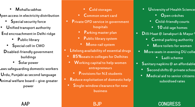
The Manifesto tags placard features tags from manifestos of 3 contenders of upcoming Delhi Polls 2013 – Arvind Kejriwal led Aam Aaadmi Party (AAP), Harsh Vardhan led Bharatiya Janata Party (BJP) and Sheila Dikshit led Congress. So watch out and vote!!!
For more description about promises made, head to this article from Economic Times.
We would all like to vote for the best man but he is never a candidate – Kin Hubbard


data source: Wikipedia
made by Vipul

Kids crying at the top of their voice enforcing parents to buy toffees and then flashing sparkling smiles after getting them, exhibiting teeth’s of chocolate..these have been my memories with toffees and surely these might have been yours too. The 25 paise parle kismi in old times to 2 rupees cadbury shots…the toffees are the one that has kept the children united. At the candy shop visualization maps out all the toffees(flavour wise) available in your local shops so you can choose accordingly. Though there might be a few misses(toffees & flavours too) in mapping them…so don’t think that I have gulped them. I will surely make them reach to you in the next post(version 2). So viewers & kids, have a happy time visualizing the network of toffees and yeah gulping them too.
P.S Viewing the visualization in Picasa Photo Viewer would be good for your eyes & mouth too 😛
made by Vipul

At the candy shop by Vipul Surender Kumar is licensed under a Creative Commons Attribution 2.5 India License.

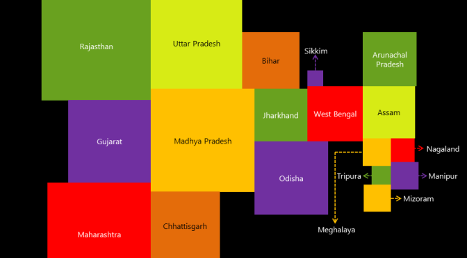
India squared visualization is an illustration of Indian states in the form of squares mapped by area…thus provides an easy visual medium to deduce the size of states. The states boundaries shared in the visual isn’t in accordance with the actual state borders.
data source: Wikipedia
made by Vipul
India squared by Vipul Surender Kumar is licensed under a Creative Commons Attribution 2.5 India License.

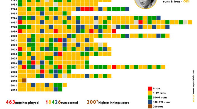
sachin tendulkar runs & tons – ODI visualization, an illustration of runs made by Team India‘s anchorman in ODI matches. Each of the color coded squares(match) is a depiction of runs(range) scored in a match over his entire career. For example the number of fifties i.e between 50-99 is shown by green squares whereas the blue squares represents the number of centuries.
data source: http://www.espncricinfo.com
made by Vipul
sachin tendulkar runs & tons - ODI by Vipul Surender Kumar is licensed under a Creative Commons Attribution 2.5 India License.